Mission
Peace through music
A nonprofit global movement connecting people through a common language transmitted through music, to challenge minds and change hearts.
How our logo, color, type, and voice work together to carry one message around the world: peace, measure by measure, through music.
Everything starts with the mark: a globe turned into a key, its teeth made of piano keys. The meaning is the mission: music is the key that unlocks peace across the whole world.
A nonprofit global movement connecting people through a common language transmitted through music, to challenge minds and change hearts.
The eight-syllable phrase Sasha Eha Tozi Hawoo®, drawn from 124 languages, lets strangers who share no tongue still sing as one.
Change happens gradually and gently, one note, one voice, one heart at a time, on a shared road to peace.
Personality
The mark is a knockout design, so it has two forms: the positive lockup (charcoal detail) for light backgrounds, and the reversed lockup (white detail) for dark backgrounds. Always pick the version that keeps the piano keys and globe ring fully visible.
A borderless world, our destination, and the people we exist to bring together.
All of humanity, regardless of nation, faith, race, or language.
Music, the universal language and the heart of everything we do.
Globe, shaft, and keys form a key: music is what unlocks peace.
A bold geometric sans, confident, modern, and plain-spoken.
Protect the logo with breathing room and never let it shrink past legibility.
Keep clear space equal to the height of the globe (“x”) on every side. Nothing (type, imagery, or edges) should enter this zone.
Below these sizes the wordmark and continents start to break down. When space is tight, use the globe symbol alone.
The mark stays consistent everywhere. Please don’t do any of these.
Never distort or change the proportions.
Keep the logo level and upright.
Only use approved brand colors.
No shadows, glows, or outlines.
Avoid busy photos without a clear ground.
Right version for the background, level, with clear space.
The core palette comes straight from the logo. A supporting warm palette adds the humanitarian warmth that carries the brand across the web and print. Tap any swatch to copy its hex.
Core, from the logo
#01A6BC · rgb(1,166,188)Primary. The globe, links, key accents and highlights.#1E2128 · rgb(30,33,40)Body text, dark sections, and deep UI surfaces.#FFFFFF · rgb(255,255,255)Space and clarity. Reversed-logo detail and surfaces.Supporting, warm & humanitarian
#C2562FPrimary call-to-action, energy, warmth.#E0A23AHope and highlights. Use sparingly.#FBF6ECWarm page background and large fields.#0A7E90Tint for depth, gradients, hovers.A clear three-part system: a geometric sans in the logo, a warm serif for headlines, and a friendly humanist sans for everything you read.
Used only within the logo. If you must re-set it, use Montserrat ExtraBold in all caps with slightly open tracking.
A small kit of motifs pulled from the mark keeps everything feeling unmistakably Destination Peace.
Avatars, favicons, seals.
Our music motif, for accents.
Music, motion, energy.
Our signature, set in Fraunces italic.
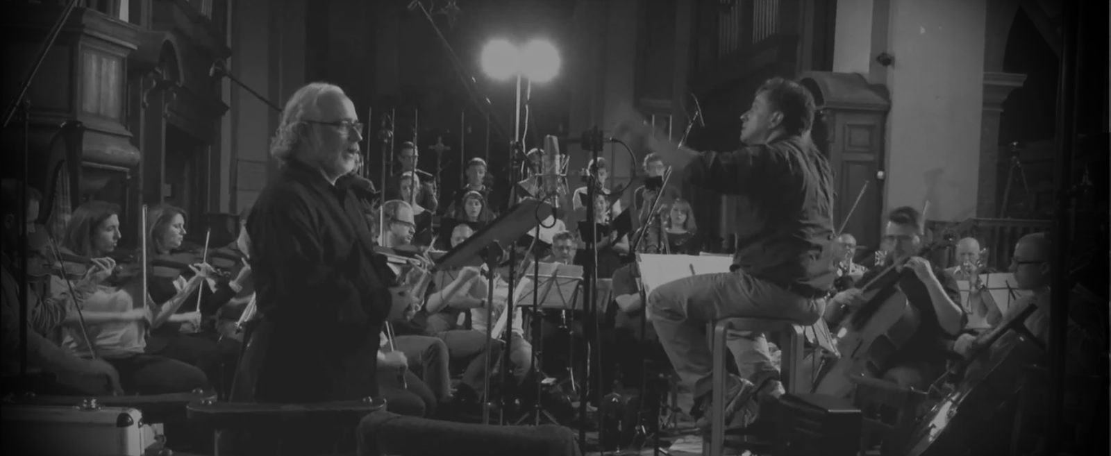
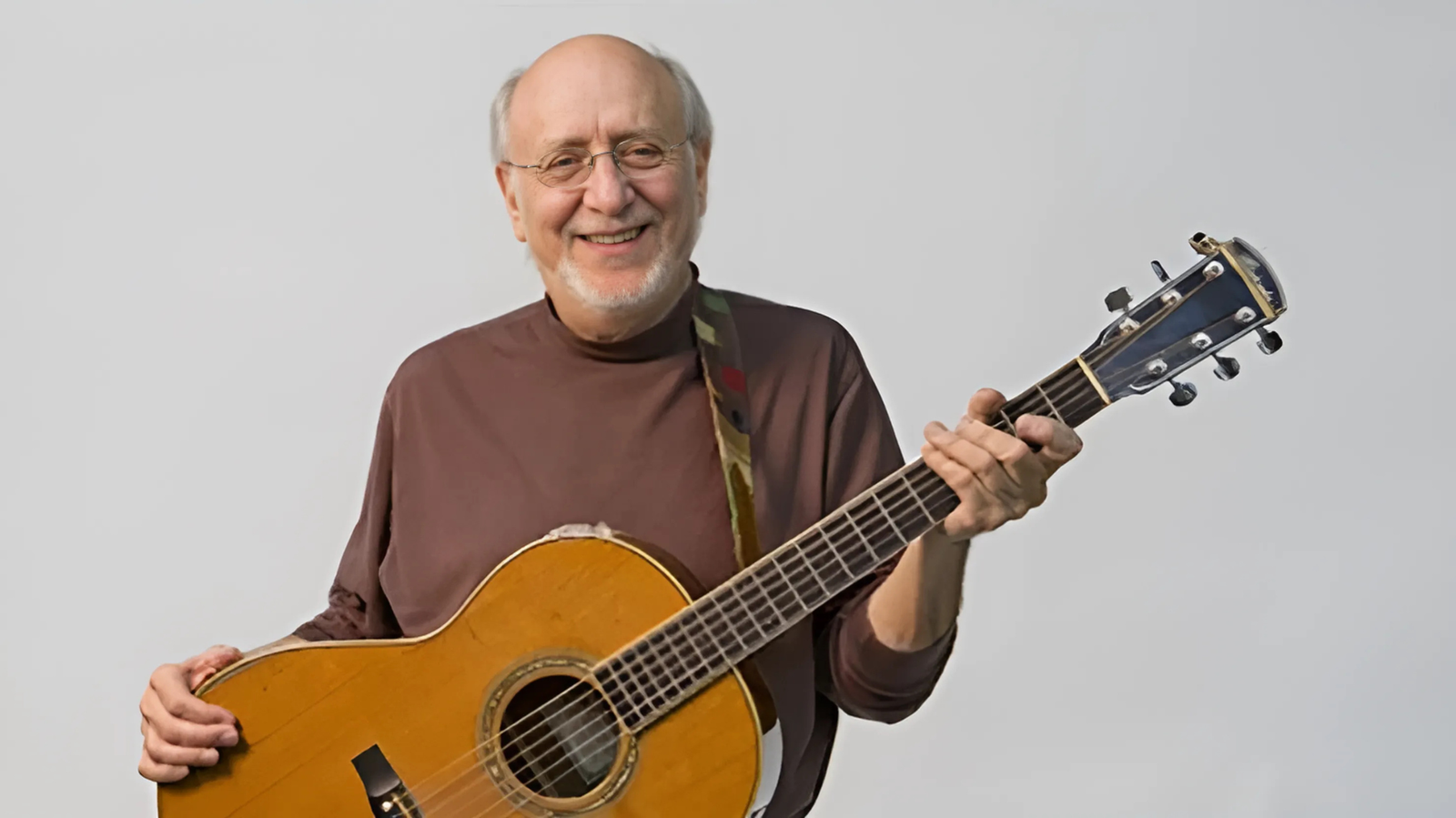
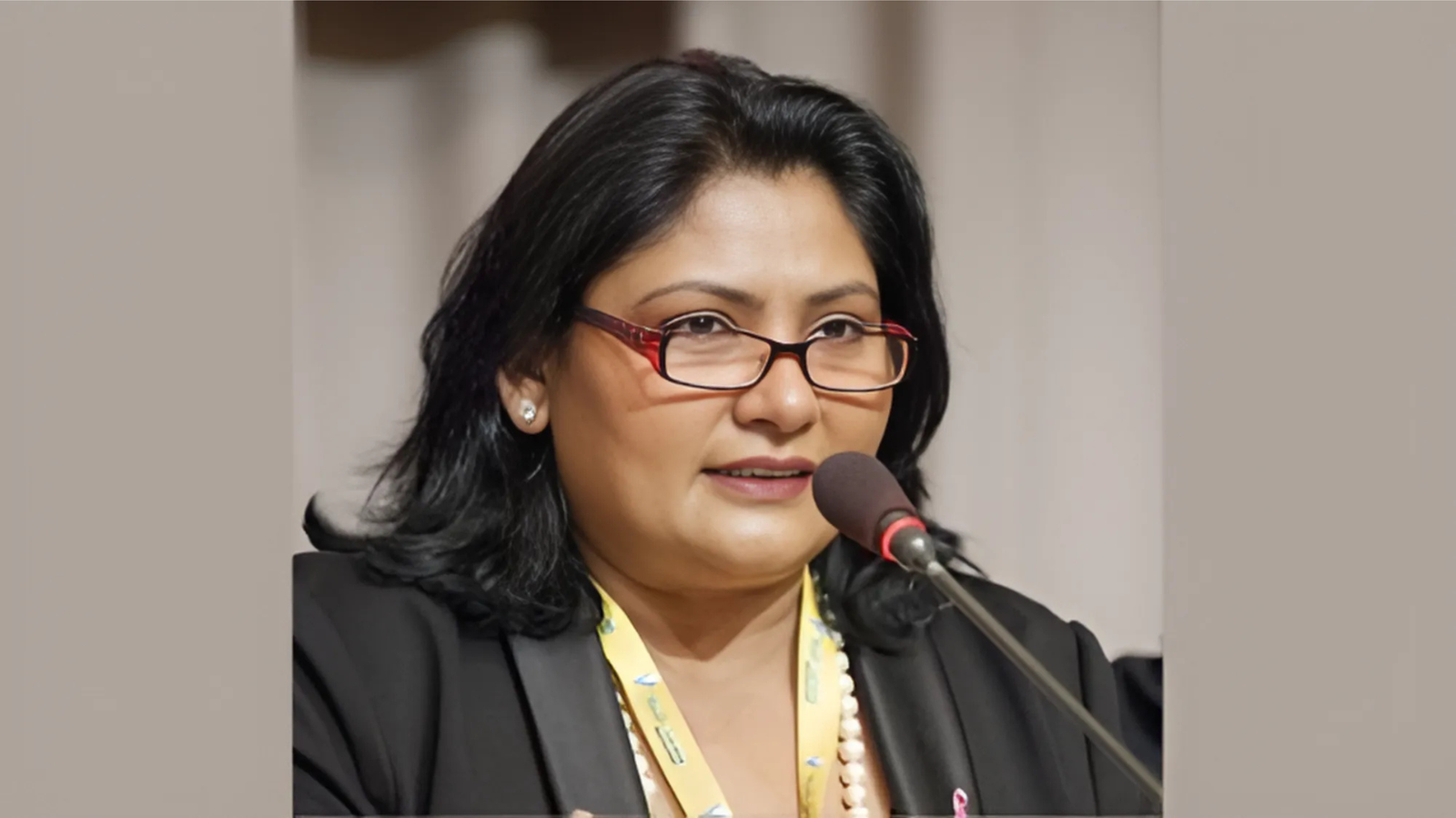
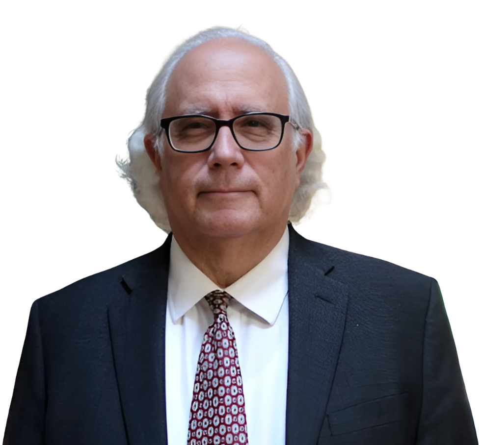
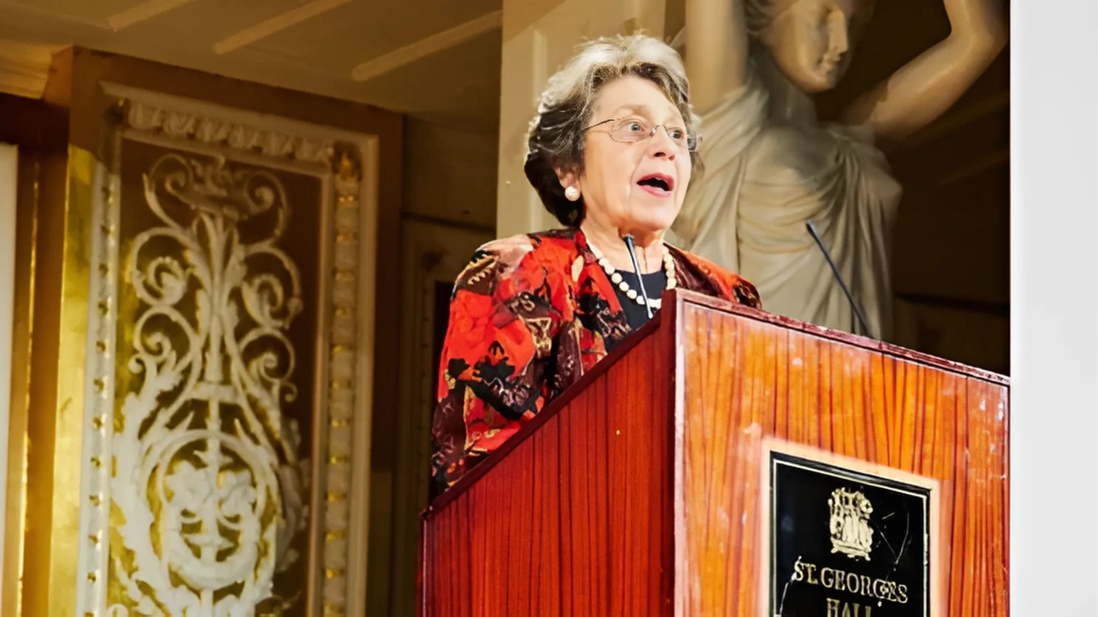
Real people, real moments. Warm, human, and documentary, never staged or stocky.
We speak the way the music feels, warm, sincere, and welcoming. We lift up; we never lecture.
Forward-looking and uplifting, even on hard subjects.
Plain, heartfelt words. No hype, no jargon.
For everyone, across nation, faith, and language.
Personal and dignified, we honor every person.
A few ways the system comes together across touchpoints.